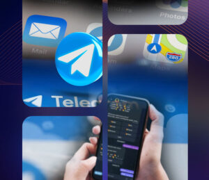
“You only have one first chance to make one first impression that lasts a lifetime.” This couldn’t be more true when it comes to mobile games, especially in this day and age when trends constantly change and there are always new games coming out in the App stores everyday. An amazing statistic to consider when it comes to visual marketing, and your game app store visuals is that a whopping 80% of people remember what they see, compared to 10% what they hear and 20% of what they read.
In our earlier app store optimization guide we talked about the important elements in your app store optimization, which are visual and textual elements. The visuals cover the overall branding of your game app, from the eye-catching icon, game screenshots, and promotional video, while the text elements cover keywords and ranking factors. Here in this blog, we’re focusing on what is seen: your game app store listing visuals make up the majority of a person’s first impression of your game app. While the text elements help with your game app ranking in App Store and Google Play as we went over in our Keyword Optimization guide, the visuals are your best foot forward that make users turn their attention to you!
Game App Store Visuals that Drive Downloads
Your app store listing has 3 visual elements:
- the App icon
- the App screenshot
- the App preview or promotional video
These 3 visual elements work together to form an appealing picture of your game app, one that will convince users to download and play it!
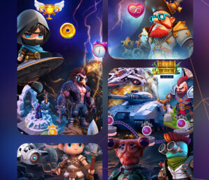
Designing a Great Game App Icon
The game app icon is front and center, serving as your logo and representation of your game brand throughout all media and platforms, even outside of App Store and Google Play. As a result, you want to nail this down right!
Once your game app is published in the app stores, changing the game app icon too often is never a good thing. For one, you’ll lose brand value when it comes to recognizing your game, and users might not be able to find your app because they’re looking for the old version. Once you have an icon design, stick with it for the most part; changing it too much also makes users suspicious on the integrity of your game.
Some helpful tips in great game app icon design:
App icons tend to be quite small especially on mobile devices. Because of this, you might want to avoid using too much text and too many colors. Stick to 2 colors and at least 3 characters so the icon isn’t overcrowded or difficult to understand at first glance.
Simplicity is key. Compelling app store visuals tend to go for colors and graphics that “pop”, often leaning to bright complementary colors with people immediately picking up on what the app is about, or something related to the theme of the game. Say for example you’re a match category game, give your icon the common image that is often matched! Or if you’re a game under the sports category, it makes sense to put the iconic sports balls or items in your icon.
Keep to simple vectors, graphics and shapes, do NOT include any actual images or photographs in your game app icon. Apple and Google stores can detect if you do, and reject your submission from publishing in the app stores.
After you’ve created a couple of designs for your game app icon, make sure to do mock ups in places where it will be seen. These include the app stores, mobile phones, social media, websites, and other digital spaces. This is to check yourself with your own eyes, that your icon looks great no matter where it’s placed.
To sum up about app icon visuals:
- Keep it simple!
- Avoid too much text and actual real photos
- Match a few standout colors to your branding
- Choose shapes and items that best represent your game and how it plays
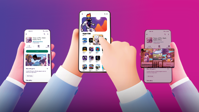
Telling a Story through App Screenshots
App screenshots allow users to get a sneak peek of your game app before downloading or buying it. The Apple Store gives you 10 slots for your screenshots while Google Play gives you 8 slots. So the best way to use this limited space is to storyboard your screenshots. Make a story thread that people can follow easily! Instead of designing each screenshot as a standalone graphic, you should aim to create a cohesive story with each slot. A good way to plot each screenshot is to simulate how a user would move through your game app after they just downloaded it.
The first screenshot is the most important. This is the ultimate form of a first impression; the first screenshot is where you want to highlight what’s the best and most appealing feature in your game. Action games definitely should show the characters in-action with epic poses or finishing moves, or the satisfying popup when a player does an ultimate combo with puzzles or match games! Even the creative sandbox can show a satisfying if not impressive builds players can make using your game. The aim is to make users intrigued with how much fun they can have when they give your game app a chance!
However keep in mind that the App Store specifically wants your game app screenshots to be actual snapshots of your game app. You can’t use abstract designs and doing so will get your submission rejected.
You can opt for uniformity and use the same screenshots for both App Store and Google Play. But keep in mind App Store guidelines because they are stricter than Google Play.
Keep the screenshots simple and easy to pick up on by your potential player base. Users can get overwhelmed when there are too many elements in a game app screenshot. You want to guide a person’s eye to the feature you’re highlighting, rather than overload them with too much information. Stick with a clean design that matches the colors used in your app icon and branding.
Lastly, the orientation of your screenshots should match how users engage with your app. Many mobile games are played in horizontal or landscape orientation, but there are some that take on a vertical or portrait orientation, and show their screenshots as such. You always want to present your app the way users will interact with it.
To sum up about app screenshot visuals:
- Storyboard your game app screenshots to tell a cohesive story
- Make the most out of that first screenshot
- Keep it simple and clean
- Use actual screens from your app
- Match color to app icon and branding
- Choose orientation portrait or landscape
App Preview or Promo Videos: Game App Store Visuals that act as Trailers
The app preview video (as it is called in the App Store) or a promo video (as it is called in Google Play) is more or less a trailer for your game app. When you’re filming and editing the video, think of what would excite people about your app. You want to highlight the most interesting parts of your app in the video. App preview videos give potential users or players or more in-depth look at your app than app screenshots can.
It’s important to remember that the App Store requires that the entire video is filmed as a screen recording of your app. Any footage filmed outside of your app will cause your submission to be rejected.
For Google Play, your video has to be hosted on Youtube as a public or unlisted video that is also unmonetized.
Like with your app screenshots, your app video’s orientation has to match how users will interact with it. This is especially important for mobile games, as most mobile games do include a preview or promo video to show off gameplay. Potential players want to see what their journey in your mobile game will look like. If your game’s video is landscape, then people will expect to be playing your game in a landscape orientation. Don’t show what isn’t in your gaming app, as this would cause distrust and bad reviews for your gaming app!
Things worth noting when it comes to length and duration in your app videos: Videos on Google Play can be longer than 30 seconds but for App Store, 30 seconds is the limit. Keep it short and sweet, as people’s attention spans aren’t that long, especially with the current trend of shorter form content, most player bases tend to only give a 10-20 second watchtime for your promo videos. They’ll pay close attention in the first 5 or maybe 10 seconds at best. Consequently, your app’s most prominent features need to be showcased in the first few seconds. You have to hook people right when the video starts playing.
Lastly, a lot of people watch videos on their phones with the sound off. You have to make sure your video is understandable even with the sound off. You can do so by integrating dynamic text elements that caption what’s going on in the video!
To sum up app video visuals:
- Keep it 30 seconds or less (even better)
- Engage viewers in the first 5-10 seconds of your video
- Show off your game as is, be honest with the orientation and feature the best aspects
- Treat video as a trailer for your game app
- Use dynamic text elements and captions
Now you have the know-hows on making a great first impression when it comes to the visual elements in your game app store front! Start standing out from the rest and get your game app to stick in one’s mind for the long-term!